Types of visualisation

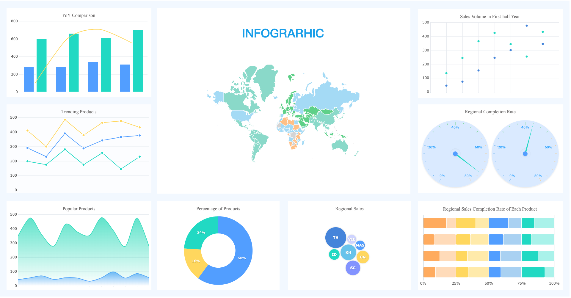
Visualisations, which use images, graphs, and charts to help us understand difficult information, are similar to storytellers for data. One popular style is the bar chart, which makes quantity comparison simple by using bars of varying lengths to represent different values. Line graphs use points connected by lines to depict changes over time and highlight trends. Pie charts display the proportions of various sections by dividing a whole into slices. Scatter plots show relationships between variables by displaying points on a graph. Maps depict geographic information, such as population density or weather patterns, using colours, symbols, and forms. These visual aids facilitate data comprehension by allowing us to quickly identify links, patterns, and trends.
Comments
Post a Comment